Roamr
Turning Trip Chaos into Calm Adventures
Time Frame
~ 4 weeks
My Role
UX + UI Design, Visual design, Branding, User flow, Research, Prototyping, Testing

About
Roamr was created to offer travelers a seamless, inspiring, and intelligent way to plan and experience their travels. From booking accommodations, tours, restaurants and events to engaging with a vibrant travel community and generating personalized AI itineraries.
Imagine opening a travel app that instantly creates your perfect itinerary, connects you with like-minded explorers, shows real travel stories and reels, and lets you book every part of your trip all in one place.

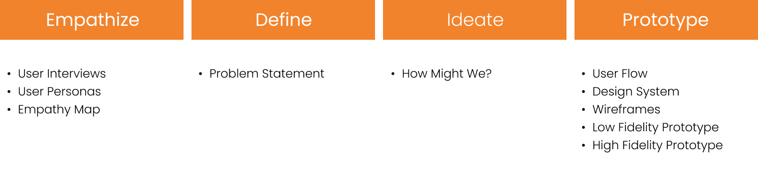
Design Thinking Process
I primarily followed the Design Thinking process throughout this project.
A user-centered approach guided each phase, Empathizing with the users, discovering their frustrations, Defining the problem and their core needs, Ideating thoughtful solutions, and Prototyping, designing and delivering a seamless travel experience.

EMPATHIZE
User Interviews
The discovery phase started with conversations. I conducted user interviews and distributed online surveys targeting travelers aged 20–45, including solo travelers, couples, families, and digital nomads. The open-ended questions focused on how they currently plan and book trips, their biggest pain points, and what would make travel planning easier or more exciting.
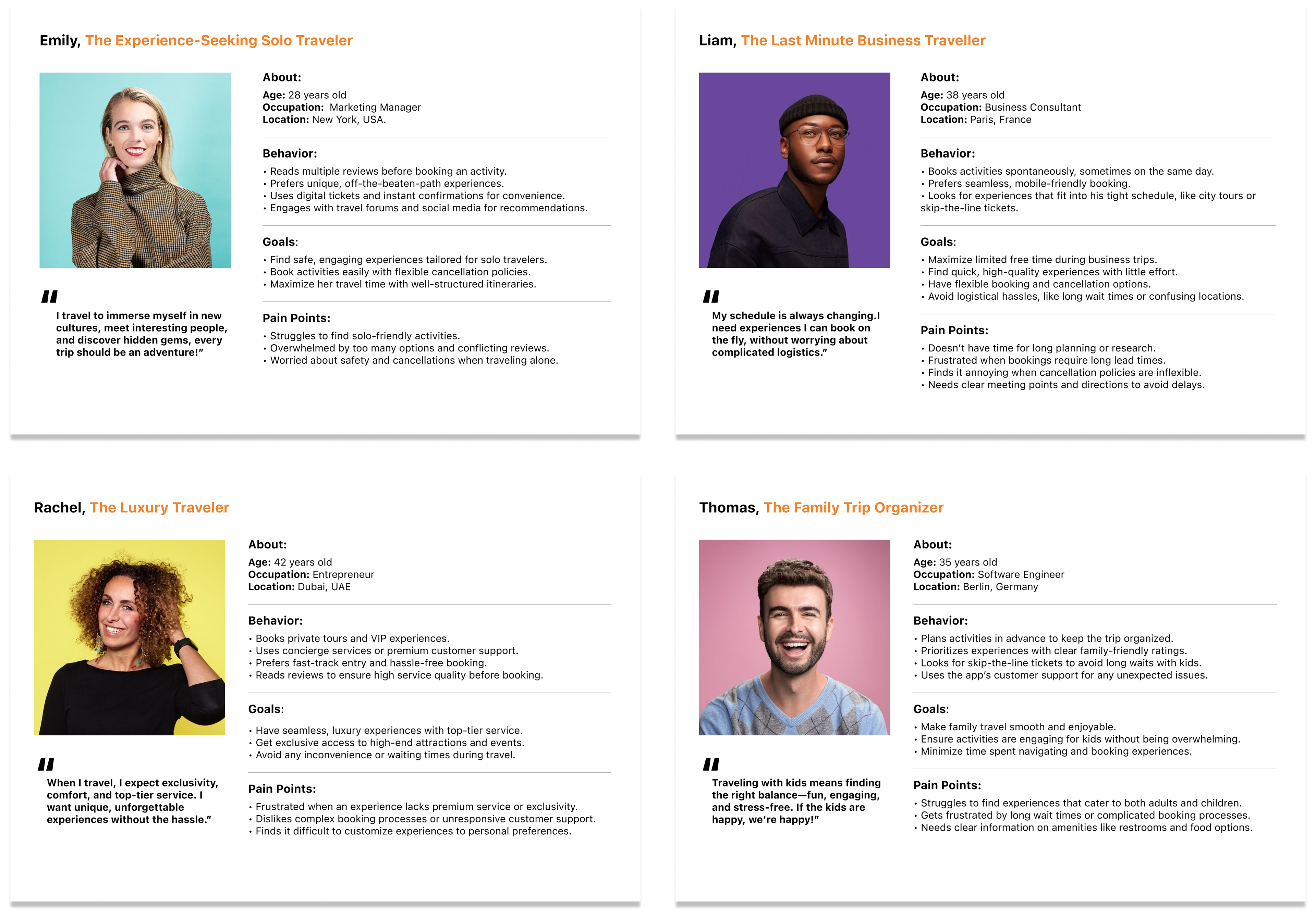
Personas
Insights from user interviews revealed distinct traveler mindsets and behaviors. These were translated into four key personas, the Solo Traveler, the Last-Minute Planner, the Luxury Seeker, and the Family Trip Organizer. Each represented a unique set of needs and expectations, helping define design decisions, prioritize essential features, and craft an experience that feels relevant and intuitive across different travel scenarios.
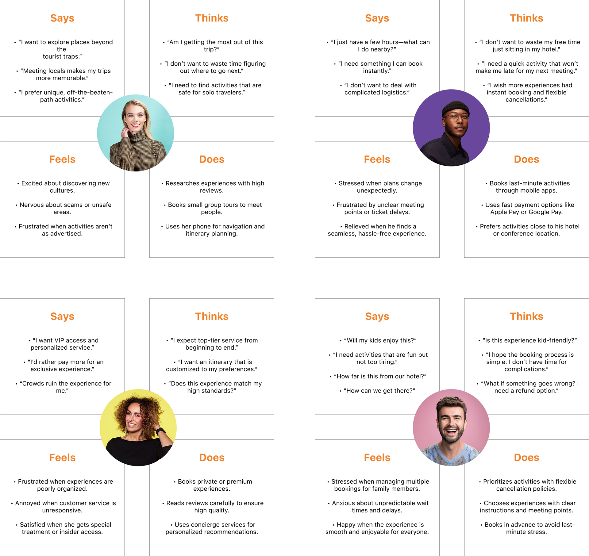
Empathy Map
To deepen understanding of users’ emotional and behavioral patterns, an empathy map was created. During the interview process, certain quotes stood out revealing pain points, expectations, and workarounds that shaped how users think, feel, and do when planning a trip. Mapping these insights visually helped translate their experiences into design opportunities with greater clarity and empathy.
Competitive Analysis
I analyzed popular travel apps such as Get your Guide, Booking.com, and Viator interms of features and user feedback.
• Hotels and tours booking
• User reviews and recommendations
• Booking management
• Activity suggestions
Gaps Identified:
• No end-to-end trip management in one place
• No Map integrations
• Lack of real-time trip collaboration with fellow traveler
Problem Statement
Despite the number of travel apps available, most only offer fragmented services users jump between multiple platforms to plan, book, and document their trips. This creates friction, confusion, and missed opportunities.
How might we create an all-in-one travel platform that allows users to plan, book, and experience travel in a more intelligent, engaging, and connected way?

IDEATE
Key Features
Each feature in Roamr was designed in direct response to user needs uncovered during research. From reducing planning stress to fosteringauthentic discovery, these solutions aim to create a seamless and trustworthy travel experience
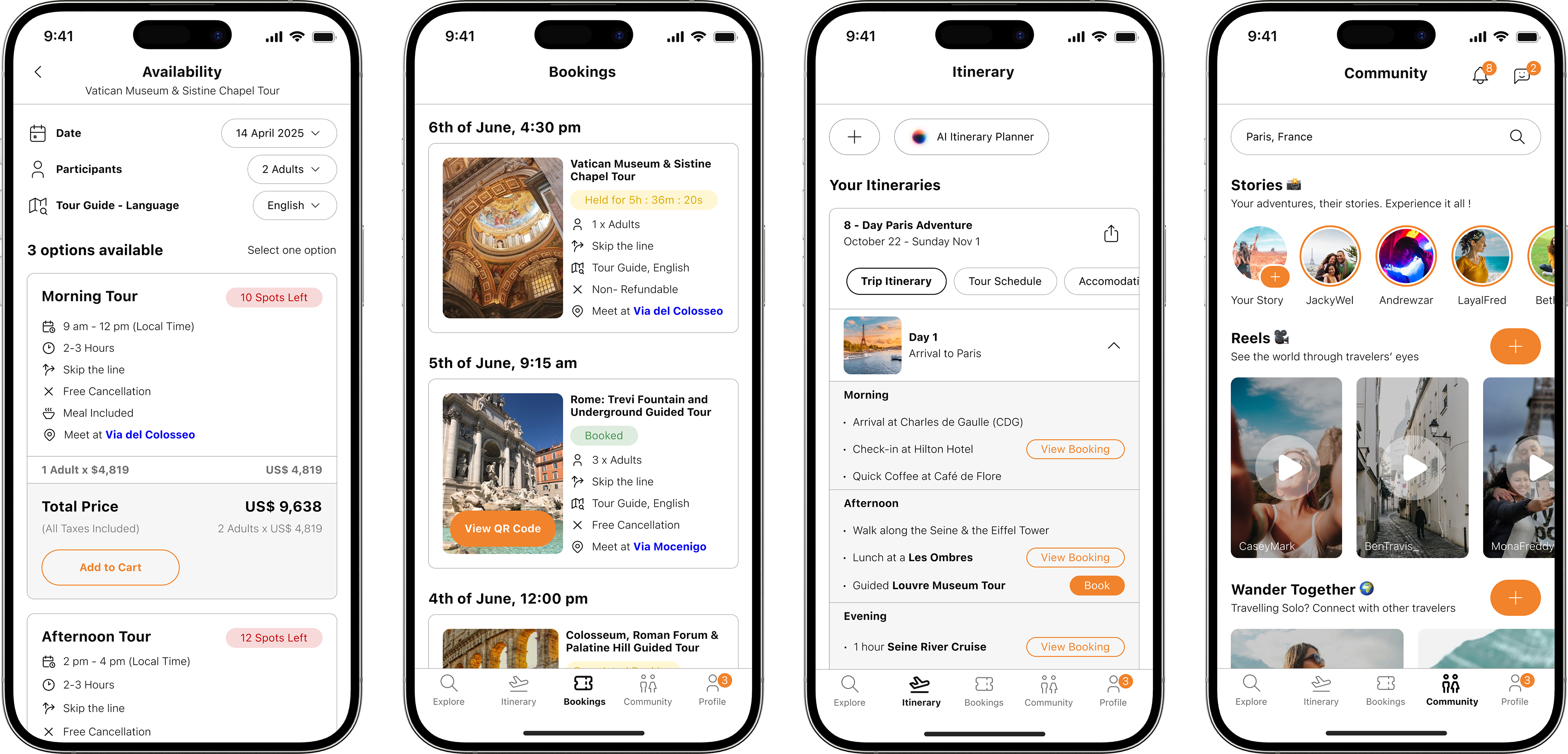
1- Unified Itinerary Planner
A centralized space to create, view, and edit daily plans, bookings, and activities. it offers clarity and control at every stage of the trip.
2- AI-Powered Trip Planning
For users short on time or inspiration, this feature generates personalized day plans based on location, time of day, and travel preferences fully editable and adaptive.
3- Community Content Feed
Responding to concerns about misleading travel content, this feature showcases real photos, reels, and stories from fellow travelers. Users can filter by destination or theme to explore authentic experiences.
4- Traveler Connection
An optional feature that enables users to connect with others visiting the same place allowing for opportunities for shared activities, meetups, or even local tips.

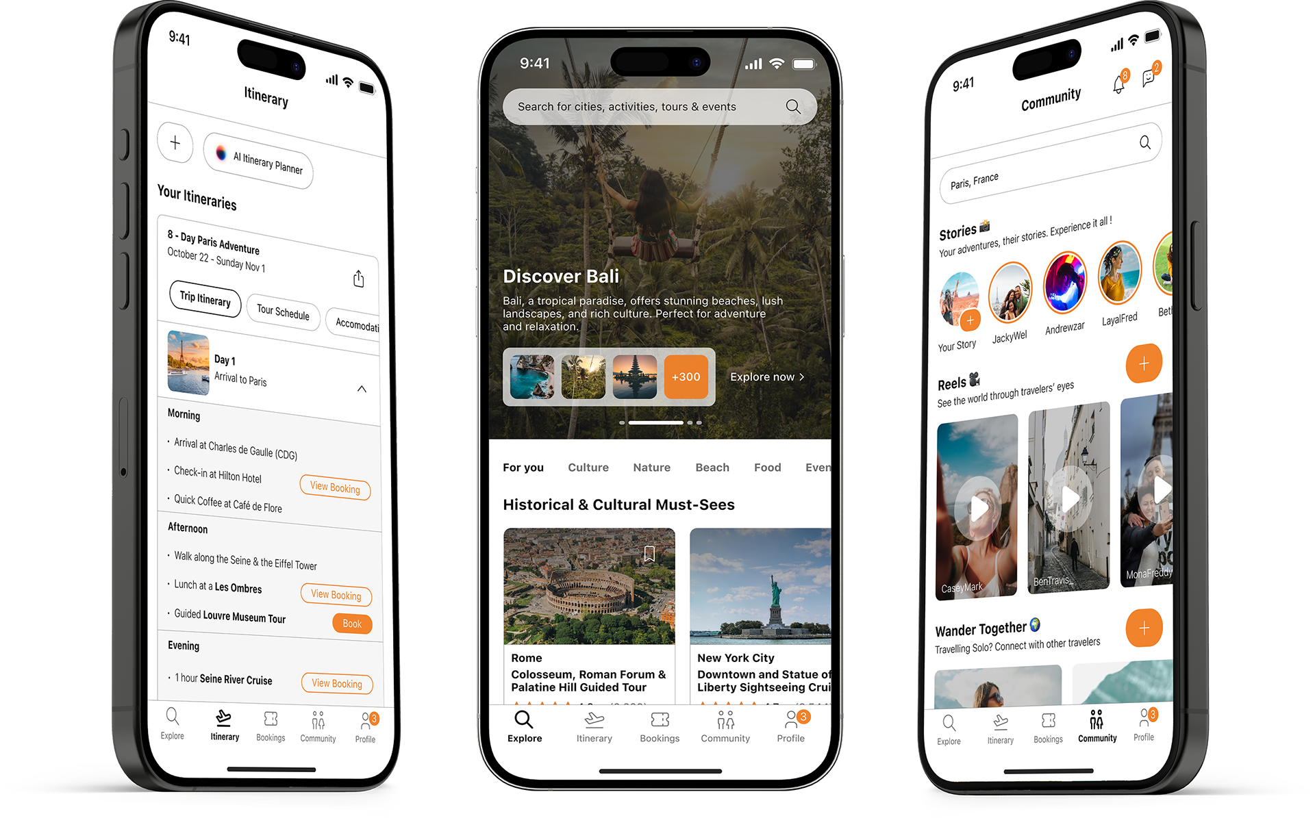
PROTOTYPE
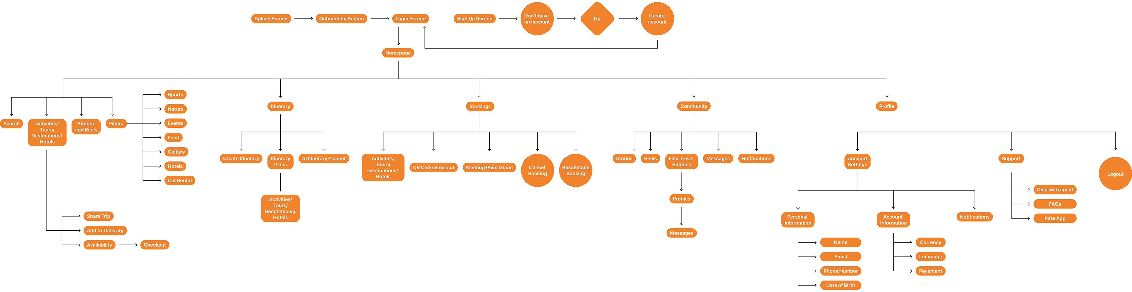
User Flow
Based on research and insights, I mapped out a user flow that supports the journey from initial inspiration to final booking and sharing.
Navigation was intentionally kept simple, with a bottom navigation bar giving direct access to the Home, Itinerary, Bookings, Community Feed, and Profile. This ensured that users could smoothly switch between planning, discovering, and socializing without cognitive overload.
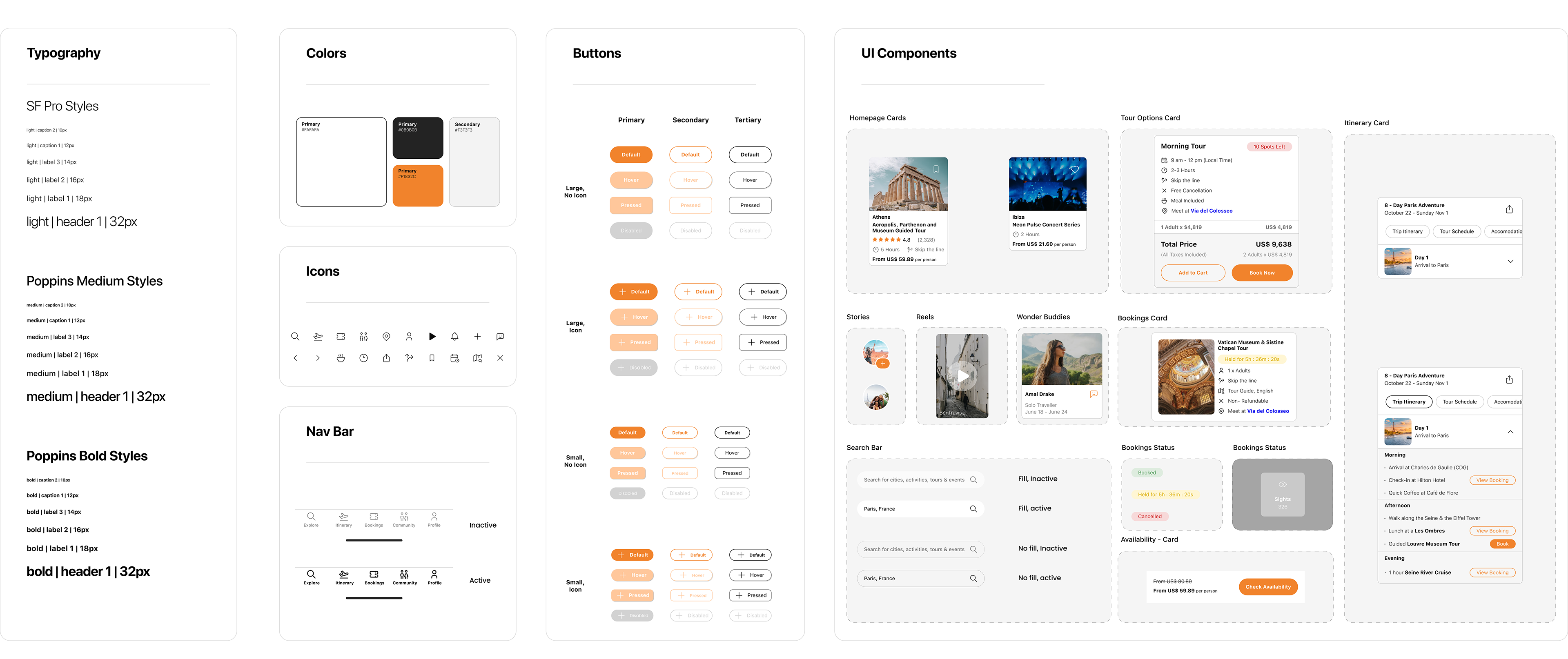
Design System
As part of building a consistent and scalable UI for Roamr, I developed a comprehensive design system. This system ensured visual coherence across all screens and helped streamline collaboration during the prototyping and development phases.
Low Fidelity Prototype
The initial sketches and wireframes focused on core flows. Various versions were created and tested. Early testing with users highlighted which steps felt confusing or redundant, and informed changes before moving to high-fidelity design.
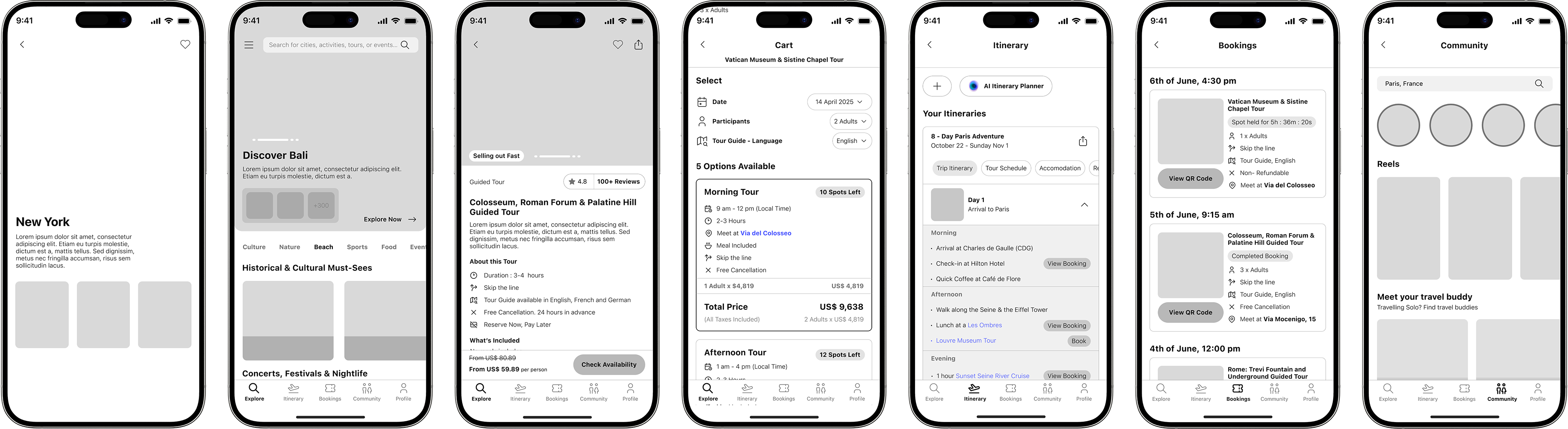
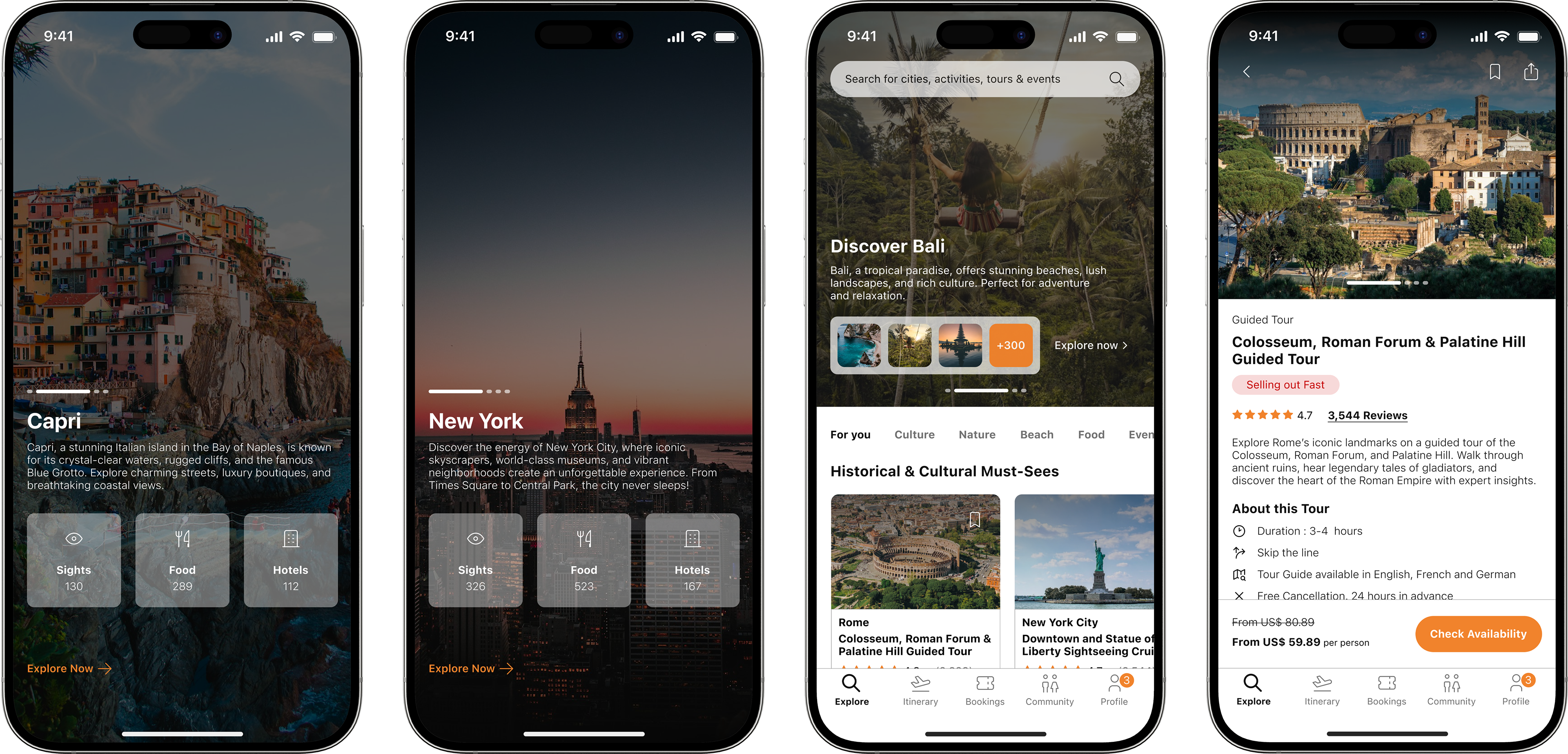
High Fidelity Prototype
The final prototype integrates the app’s full visual identity, branding, and refined user flows. With feedback from multiple usability testing rounds, the app now presents a polished experience with clear call-to-actions, a focus on accessibility and seamless transitions between planning and booking, and an engaging community vibe.